A small selection of photos I took for a photo for the Best of Bowie CD cover.
I felt that I needed something odd and interesting to fit in with his eccentric style of music. I also felt that the edit of these photos needed to be quite 70s/80s retro style to fit with the era the songs were released.

I took this upside down originally in the attempt to make it seem more interesting and obscure, but it turned out to just look like a picture of some cranes upside down and did not have the desired effect.

I edited it to make it a little more moody but it still didn't work out how I expected it to.

I saw these and thought that with a bit of editing it could look like some sort of other-worldly surface, like the moon surface or something.

I feel that the editing does add a lot to it, the only issue is the fact that there is no real place to add text as the whole image is very busy. There is also no main focus point to the image which causes it to lack something.

I took this some time ago and noticed the reflection in it looked a lot like a UFO. This fits within the Ziggy Stardust theme so I decided to edit it and see if I could make something interesting of it.

Although the picture itself is interesting I don't really feel that it fitted in with all the tracks on the Best of Bowie CD, the countryside surrounding doesn't really go with the theme or style of music.
Final ideas

Original image of dog

Cropped and edited briefly

I drew this in the style of David Bowie's makeup on the Aladdin Sane album cover (below), took a picture and removed the background.

I laid it over the top of the image I had taken and manipulated it in order to fit in with the image. I also added some text.

This is the same as above except I have blurred out the background behind the text in order to make it stand out some more. This is my favourite version.

Again this is the same except I have made some of the cover blurry. I do not like this as much.
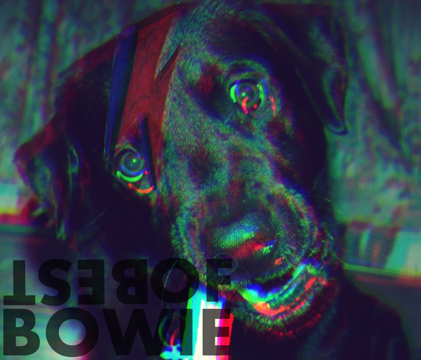
I feel that this image was appropriate because of the striking eyes, David Bowie is known for his odd mismatched eyes and although the dog's eyes are not mismatched they are still very captivating.

This is another image I have taken which I feel is appropriate to be used as an image for the Best of Bowie album cover.

Here I have altered the colours in order to pull the image together as well as adding some text.

Here I have added the lightning bolt again and made it transparent so the text is able to be seen through. It also adds some colour to the image.

Here I have added a motion blur effect, I feel it brings the text and the image together as well as fitting in with the style of the music.
I have used the images of the dog because other than the fact that they're quite obscure, it's also a small reference to Bowie's song 'Diamond Dogs'.
No comments:
Post a Comment